TVGrid: The 3-Day Bet That Fixed a Frozen Xbox Home Screen
5 minutes read •
Short version: A persistent half‑second feeling freeze on an Xbox streaming app vanished after replacing a stack of generic layout/navigation helpers with ~3 focused days of bespoke geometry + focus modeling. This is the story, the decision framework, and the transferable lessons.
Problem Context
In 2018–2019 I was one of four engineers building the VRV streaming app for Xbox One using React + TypeScript. It had to feel native to a game console: instant directional focus jumps, graceful motion, no dropped frames, no waiting. One afternoon a pattern emerged—we would navigate back to Home and for a beat the interface just froze. Not a crash. A brief stall long enough to break immersion and remind you there was a browser under the hood. On a large screen, that hitch is trust erosion.
Content growth caused it. Marketing kept adding rails (rows). Design wanted sticky headers and asymmetric groupings. The more eclectic the layout became, the more the generic layout + navigation helpers buckled. Libraries gave us abstractions; the Xbox controller demanded guarantees. I let the problem idle in the background—sketching rectangles, rehearsing focus paths mentally—until the model felt inevitable. Then I cleared three days and built what became “TVGrid”.

The Moment of Decision
The choice was not “build a grid” versus “use one”. It was: continue patching around opaque behavior, or own the mental model governing focus, scroll, and anchoring. The existing approach fought us—layout reflows, unpredictable fallback focus, hidden performance costs. A lean in‑house layer could instead: precompute space, move only transforms, and never guess.
A Three-Day Sprint
Day 1: carve the world into deterministic rectangles on paper; translate them into a data structure the runtime can trust.
Day 2: wire controller intent (up, down, left, right) directly to geometry instead of DOM heuristics.
Day 3: sand edges—off‑screen items fade in; headers feel fixed without hacks; guardrails for edge cases.
After that it looked like it had “always been there”.
From the product perspective we hadn’t added a feature; we had removed a sensation: waiting.
What Actually Changed
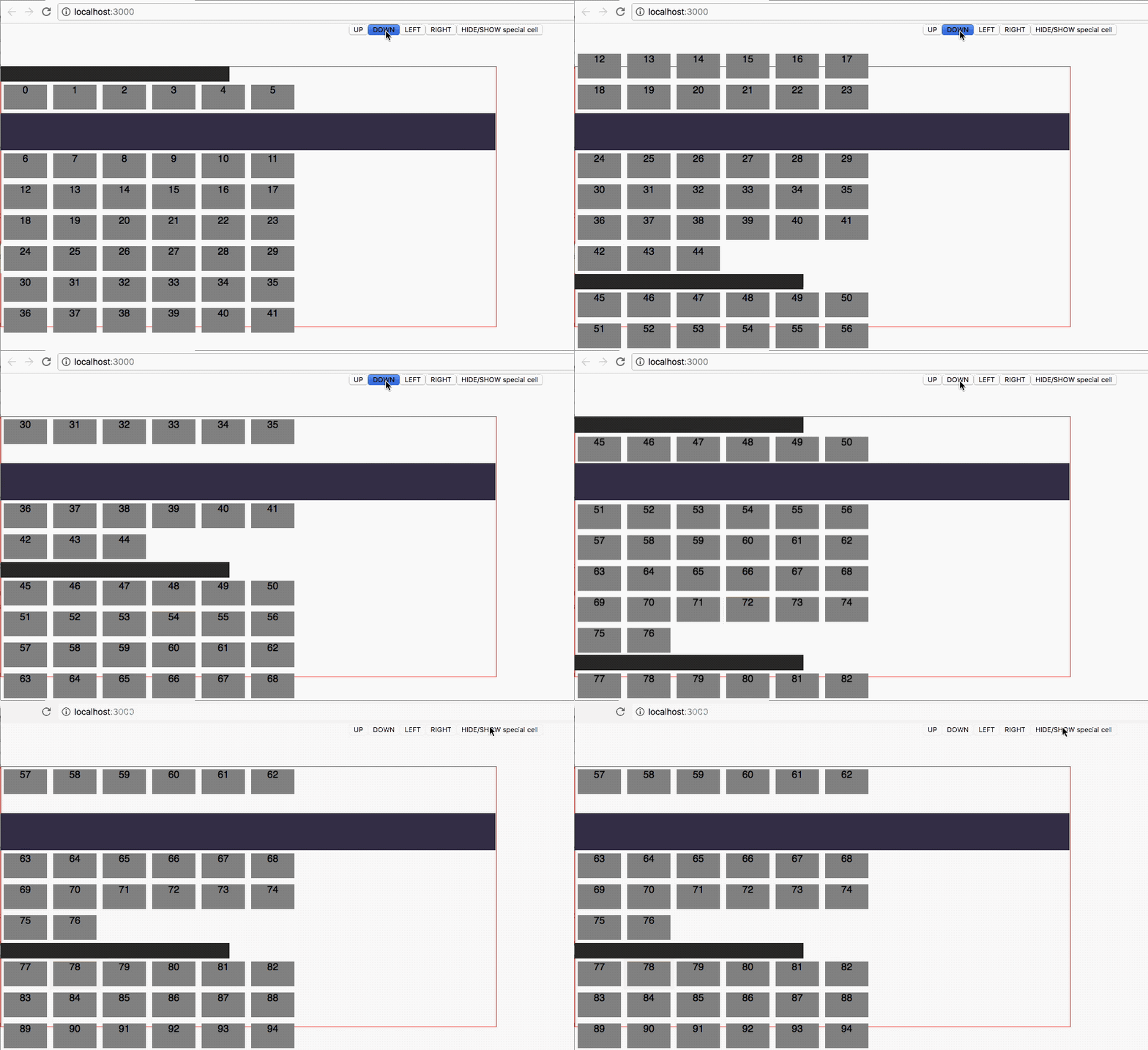
Here’s where the story shifts: Instead of relying on the browser’s layout engine to figure out where things should go, the grid took charge. Every cell, every header, every element was given an exact set of coordinates—absolute positions, mapped out ahead of time like seats in a theater. When you pressed a button, the grid didn’t ask the browser to shuffle things around; it simply animated the movement, sliding the whole view smoothly to reveal the next set of content.
Scrolling wasn’t a negotiation with the DOM—it was a choreography. The grid used animation to move the visible window, making transitions feel intentional and fluid. The result was a UI that felt alive and responsive, not just technically correct but emotionally satisfying. The magic wasn’t in the code—it was in the feeling that every movement was exactly where it belonged, every time.
Decision Framework (Build vs Buy)
Build a bespoke layer when:
- Latency is user‑visible and tied to abstraction overhead you cannot easily profile or trim.
- You need guarantees (deterministic focus paths) rather than heuristics.
- The conceptual surface of a custom solution is genuinely smaller than the workaround surface area.
- You can articulate the entire mental model on a whiteboard in < 10 minutes.
Do not build when:
- Requirements are still volatile and exploration speed matters more than determinism.
- Commodity solutions already meet 90% of user experience targets.
- Your team lacks a maintainer willing to own the core primitive.
What Success Looked Like
- Perceived freeze removed (qualitative measurement—no instrumentation snapshot retained).
- Controller navigation felt “inevitable”: no accidental diagonal drift, no mis‑focus recovery flicker.
- Designers stopped flagging “header jitter” in reviews.
- Another engineer shipped a minor enhancement post‑handoff without consulting me.
When Not To Rebuild
Don’t chase novelty. If the freeze had been solvable by instrumentation + tuning existing libraries, that was cheaper. The inflection point was when mental simulation of a simpler model was clearer than explaining another workaround PR.
Lessons Learned
- Small, purpose‑built layers unlock performance and clarity when generic abstractions hide the levers you actually need.
- Precomputation trades minor upfront work for durable runtime calm.
- “Feel” bugs benefit from narrative rehearsal before code—walk the user path mentally until a simpler invariant emerges.
- Maintenance risk shrinks when the code embodies one named idea with crisp boundaries.
- Success metrics can be qualitative if they map to human perception (responsiveness) and are paired with a clear regression story.
TVGrid served thousands of cells without drama. It never became a sprawling framework; it stayed a sharp tool. After I moved on, another engineer extended it with minimal ceremony—that counted as validation.
Aftermath & Reflection
The product was eventually sunset (as many are). The grid never shipped as open source; it didn’t need to. Its value was local: restoring responsiveness, reinforcing a culture of owning interaction primitives, and proving that “we can build this” can be the safest, fastest path.
If you’ve got a UI freeze that keeps returning like a creak in a house, tell yourself the story of how it should work—end to end—without naming libraries. If that story is short and stable, you may already have the spec for the lean piece of software that will fix it.
Key Takeaways
- Eliminating a tiny pause can lift perceived quality more than adding a new carousel.
- Sometimes “custom build” means fewer moving parts, not more.
- Clear mental models make future iteration cheaper.
Closing Thought
Great platform experiences are often defined not by adding one more animation, but by removing the invisible tax of hesitation. TVGrid was the removal of hesitation.